

White Balance
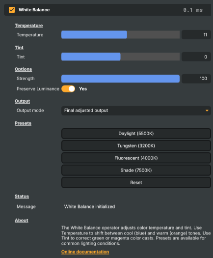
Introduction
The White Balance operator corrects the colour temperature and tint of an image so that whites read as white instead of carrying the colour cast of the light that produced them. Every light source — sunlight, fluorescent tubes, household bulbs, overcast skies — has its own colour, and footage shot under one will look "wrong" to the eye when viewed alongside footage shot under another. White Balance neutralises that cast so the image looks like it was lit by clean, neutral light.
A correctly white-balanced picture is the foundation of every other colour decision down the chain. Drop a White Balance operator early on each input that needs correcting, get whites neutral and skin tones natural, and the rest of the grade — colour curves, LUTs, vibrance — has a clean canvas to work from.
When to reach for it
Three situations come up constantly in broadcast and live streaming:
- The footage looks too warm or too orange. A studio lit by tungsten or warm LED panels comes off the camera with a noticeable orange cast. Cool the image down with a negative Temperature value, or apply the Tungsten preset as a starting point.
- The footage looks too cool or too blue. Subjects shot in open shade on a sunny day, on overcast afternoons, or under cool LED panels look blue and lifeless. Warm the image up with a positive Temperature value, or apply the Shade preset.
- Skin tones look slightly green or sickly. Fluorescent and many older LED tubes leave a faint green cast that's especially unflattering on faces. Counter it with a positive Tint value (around +20 to +30), or apply the Fluorescent preset.
Each of these is a correction — the goal is a neutral starting point, not a creative look. Once the picture is neutral, build any creative grade on top with a Color Curves or Grading LUT operator further down the chain.
The two axes
White Balance works along two independent axes:
- Temperature — the blue ↔ orange axis. Negative values cool the image (add blue, subtract orange); positive values warm it (add orange, subtract blue). 0 is unchanged. This is the axis that handles the difference between tungsten lighting (warm), daylight (neutral), and shade or overcast (cool).
- Tint — the green ↔ magenta axis. Negative values add green; positive values add magenta. 0 is unchanged. This is the axis that handles the green cast of fluorescent and some LED lights, and any residual non-tungsten/daylight bias the Temperature slider on its own can't correct.
Real-world light sources rarely sit exactly on the Temperature axis — fluorescents add green, some sodium-vapour lamps add a strong tint of their own, mixed-light scenes (a window-lit room with tungsten lamps on) tilt in two directions at once. Having Temperature and Tint as separate controls means you can correct each kind of cast independently rather than fighting one with the other.
Presets
Four one-click presets give you tested starting points for the most common lighting types. They don't lock you in — they just preload Temperature and Tint to known-good values, and you can fine-tune from there.
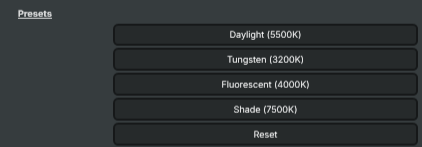
- Daylight (5500K) — neutral reference. Sets Temperature and Tint both to 0. Use it as a baseline for normal daylight shoots, or as a quick "back to neutral" without a full reset.
- Tungsten (3200K) — cools the warm orange cast of household bulbs and traditional stage tungsten lamps. Temperature −35, Tint +5.
- Fluorescent (4000K) — counters the green tinge of office and retail fluorescent tubes that gives faces a pale or sickly look. Temperature −15, Tint +25.
- Shade (7500K) — warms cool open-shade or overcast outdoor footage that has gone blue. Temperature +30, Tint +5.
Apply the preset that's closest to your lighting condition, then nudge Temperature and Tint by a few points until the picture looks right on a calibrated monitor. Reset snaps everything back to 0/0/100, which is also useful as a known clean starting point before scripting a correction.
Strength and Preserve Luminance
Two further options shape how the correction is applied:
- Strength — the blend between the original image (0) and the fully corrected image (100). Default is 100. Lower it to soften an aggressive correction — for example, take a strong shade-preset correction down to Strength = 60 if you want to warm a blue shot without fully neutralising it. Animating Strength over time produces a smooth transition from one white balance to another, useful when the lighting changes mid-shot (clouds rolling over a window, a presenter moving between lit zones).
- Preserve Luminance — when on (the default), the operator keeps brightness constant and shifts only colour. Off, the temperature and tint adjustments can also push brightness slightly, which produces a stronger but less predictable look. Keep it on for technical corrections; turn it off only when an extra punch is genuinely wanted.
Inspecting the correction
The Output mode dropdown (in Advanced options) lets you see what each control is contributing in isolation:
- Final — the corrected image. Leave this on for normal use.
- Temperature only — the picture with the Temperature adjustment applied and Tint forced to 0. Useful for confirming the warm/cool shift is what you want before adding Tint.
- Tint only — the inverse — Temperature forced to 0 with just the Tint contribution applied.
- Luminance mask — a greyscale visualisation of where the operator is preserving luminance.
Keyboard shortcuts in the operator panel: F1–F4 switch between the four output modes, F5 resets all values.
Common use cases
- Neutralising the studio look — drop a White Balance on each camera input, pick the preset closest to your studio lighting, then tweak Temperature and Tint by a few points until the talent's skin reads natural. Saves the colourist a fight later.
- Matching mixed-camera shoots — different cameras white-balance differently even when pointed at the same scene. Add a White Balance to each camera's input layer and tune until cuts between cameras don't shift in colour.
- Correcting on-location footage — interview footage shot in offices, conference rooms, or shaded outdoor spots almost always needs some white-balance work before it's broadcast-ready. The Fluorescent and Shade presets are starting points for the two most common cases.
- Creative stylisation — leave neutral white balance behind and push Temperature and Tint to create a deliberate cast. Warm, golden-hour looks come from positive Temperature; cold, moody looks from negative Temperature plus a touch of green tint. Useful for trailers, idents, and thematic segments.
- Transitioning between looks — animate Strength (or Temperature/Tint directly) to slide between two white-balance states, e.g. easing from a warm intro to a neutral show body.
White Balance - Settings
Temperature
Temperature — controls the warm/cool axis of the colour correction.

| Property | Description |
|---|---|
Temperature |
Shifts the image along the blue/orange (cool/warm) axis. [min=-100, max=100, default=0]. 0 leaves the image untouched. Negative values cool the image (more blue) — use when footage looks too warm/orange. Positive values warm it (more orange) — use when footage looks too cool/blue, e.g. shaded outdoor scenes. The presets give starting points for common lighting types. |
Tint
Tint — controls the green/magenta axis of the colour correction.

| Property | Description |
|---|---|
Tint |
Shifts the image along the green/magenta axis. [min=-100, max=100, default=0]. 0 leaves the image untouched. Negative values add green; positive values add magenta. The most common use is countering the slight green tint of fluorescent lighting with a small positive value (around +20 to +30). |
Options
Options — overall blending behaviour and luminance preservation.

| Property | Description |
|---|---|
Strength |
Blend amount between the original image and the corrected image, in percent. [min=0, max=100, default=100]. 0 is the original image, 100 is the fully corrected image. Use intermediate values to dial back an aggressive correction or to gradually animate the white balance change over time. |
Preserve Luminance |
When on, brightness is held constant while colours are shifted. On preserves the original exposure/brightness — only the colour balance changes, usually the safer default. Off lets the temperature and tint adjustments also push brightness slightly, which can produce stronger but less predictable looks. |
Output
Output — visualisation modes useful for diagnosing what each control is doing.

| Property | Description |
|---|---|
Output mode |
(advanced) Selects what the operator outputs. Default is the final corrected image. Use Final for normal operation. The other modes show only the temperature contribution, only the tint contribution, or a luminance mask — handy for understanding why a correction looks the way it does. Keyboard F1–F4 switch between modes when the panel has focus, F5 resets all values. |
Presets
Presets — one-click starting points for common lighting conditions.
| Property | Description |
|---|---|
Daylight (5500K) |
(advanced) Apply the Daylight preset (~5500K) — neutral reference, sets Temperature and Tint to 0. Use as a baseline for footage shot in normal daylight conditions. |
Tungsten (3200K) |
(advanced) Apply the Tungsten preset (~3200K) — cools warm indoor incandescent lighting (Temperature=-35, Tint=+5). Use for footage shot under traditional household bulbs or stage tungsten lamps that look too orange. |
Fluorescent (4000K) |
(advanced) Apply the Fluorescent preset (~4000K) — counters the green cast of fluorescent tubes (Temperature=-15, Tint=+25). Use for office, retail and institutional lighting that gives faces a pale or sickly look. |
Shade (7500K) |
(advanced) Apply the Shade preset (~7500K) — warms cool open-shade or overcast outdoor footage (Temperature=+30, Tint=+5). Use when subjects are shot in shadow on a sunny day or under heavy clouds and look too blue. |
Reset |
Reset all settings to their defaults (Temperature=0, Tint=0, Strength=100). |
Status
Status — feedback messages reporting reset and preset actions.

| Property | Description |
|---|---|
Message |
Latest status message from the operator (read-only). Reports which preset was applied or that values were reset. |
Inherits from: AbstractOperator, AbstractAudioMetering.
See also: White Balance in Script Engine Objects.
Related components
Composer's Color Correction family contains nine operators that work on the colour of the image. Each takes a different approach — picking the right combination is part of the grading workflow, and the operators are designed to be stacked. The other Color Correction operators are:
- Automatic Gain Control — measures average brightness in a sensor area and optionally nudges the picture back to a stored reference luminance. Good for stabilising drifting exposure on long-running feeds.
- Color Adjust — general-purpose colour correction with gain/gamma/lift, HSV adjustments, per-channel RGBA, and clipping in one operator. The fastest way to match cameras, tame highlights, or lift crushed blacks.
- Color Curves — master and per-channel (R/G/B/A) curve editor with an automatic grey-card camera-calibration workflow. The right choice when you need precise control over a specific tonal range.
- Color Shift — three-zone colour balance (shadows / midtones / highlights) along Cyan/Red, Magenta/Green, Yellow/Blue. Build cinematic teal-and-orange looks or fix mixed-lighting casts that hit shadows and highlights differently.
- Grading LUT — applies a pre-baked Hald CLUT image to drop a finished colour grade onto a feed in a single step. The fastest way to deploy a house style across many compositions.
- HSV Correct — per-hue curves for hue, saturation and luminance. Boost just the blues in a sky, lift skin tones without touching the background, desaturate one specific colour family.
- Hue Shift — selects a hue band by centre, tolerance and softness, then shifts its hue, saturation or luminance independently. The tool for recolouring a specific object without affecting the rest of the image.
- Vibrance — boosts the colourfulness of muted tones while protecting already-saturated colours and skin tones. Make landscapes pop without making faces look orange.