

Vibrance
Introduction
The Vibrance operator boosts the colourfulness of a picture in a smart way: it lifts the muted, undersaturated colours and leaves the already-vivid ones mostly alone. Drop it on a flat-looking outdoor shot and grass and sky get more punch, while the colour intensity of red sweaters, neon signs, and brand graphics barely moves. Drop it on a presenter and the background warms up while their face stays the colour it was supposed to be.
It's one of two tools in Composer that change colour intensity — the other is the saturation control inside Color Adjust. Use Vibrance when you want to add life without crushing what's already there; use saturation when you want a uniform global colour-strength change. Most of the time, Vibrance is the right choice.
What "vibrance" actually means
Plain saturation is a blunt instrument. Crank it up by 30% and every pixel gets 30% more colourful — the dull greens, the vivid reds, and crucially the skin tones, all at the same rate. The dull greens land somewhere usefully greener, but the vivid reds clip into a cartoonish wall of pure red and the skin tones go orange. That's why saturation alone rarely produces a clean result on real footage.
Vibrance is a non-linear, "smart" saturation. The operator looks at each pixel and decides how much to boost it based on how saturated it already is:
- A grey, near-colourless pixel gets the full boost — it has the most headroom and benefits the most from a lift.
- A pixel that's already vivid (a saturated red, a bright neon sign) gets a small boost — it's already loud, and pushing it further only clips into garish.
- The boost ramps smoothly between those two extremes, so the operator never produces a hard edge between "boosted" and "not boosted".
The result is a picture that gains colour where colour is missing, while protecting the parts that already have plenty. Landscapes pop without skies turning radioactive. Sports pitches deepen without team jerseys clipping. Flat overcast footage gains life without becoming a fluorescent caricature.
Additionally, vibrance algorithms typically pull back hardest on hues that fall in the skin-tone range, on the principle that faces are the part of the picture the eye trusts least and notices most. Boost the picture, and faces stay the colour they were filmed at while everything else lifts around them.
Controls
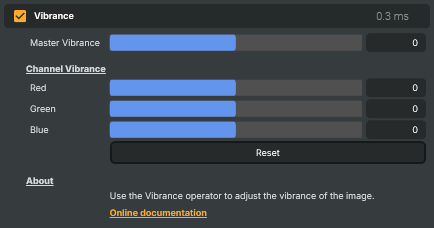
Four sliders, all on the same -100 to +100 scale, all defaulting to 0 (no effect):
- Master Vibrance — the global vibrance lift, applied across all colour channels. Positive values add life to undersaturated regions while protecting vivid colours and skin tones; negative values drain colour from undersaturated regions first, producing a faded or vintage look. 20–40 is a comfortable starting range for a "lift" — anything beyond ~60 starts to push the protected regions too, and the smartness of vibrance gives way to plain saturation.
- Red / Green / Blue — per-channel offsets that stack on top of Master Vibrance. Use them to target a specific colour family without changing the rest:
- Red positive — make reds pop without boosting greens or blues. Negative — tame an over-warm scene.
- Green positive — intensify foliage, grass, and other greens without lifting other colours. Negative — mute background plants when they're pulling attention from the subject.
- Blue positive — bring out skies and water without boosting reds or greens. Negative — warm the picture by softening the blue end, or tone down a too-strong sky.
Per-channel offsets are additional to Master — set Master to +20 and Blue to +20, and the blues effectively get +40 worth of vibrance while reds and greens get +20.
The Reset command snaps everything back to 0.
How to set it up
Vibrance is a finishing operator — it earns its keep on top of an already correctly exposed, colour-balanced picture. The order in the operator chain matters:
- White Balance first, so the picture starts from a neutral colour cast.
- Exposure / contrast (Color Adjust or Color Curves).
- Vibrance — add the colour lift on top of a clean base.
- Grading LUT last if you have a creative grade to apply.
Dial Master Vibrance up first and judge the picture as a whole; only reach for the per-channel offsets when one specific colour family needs extra (or less) attention than the master is giving it.
Common use cases
- Outdoor and landscape pop — lift Master Vibrance to +25 to +35 to deepen sky, foliage and ground without making faces or vivid objects feel artificial. The single most common use of the operator.
- Lifting tired or flat-looking footage — older cameras, low-end encoders, and footage from low-light shoots often come off the chain looking colour-anaemic. A moderate positive Master Vibrance restores life without giving away that anything was wrong.
- Adding life to overcast outdoor scenes — overcast light is colour-neutral but also colour-flat. Vibrance is the right tool to bring out what colour the scene does have, rather than saturation which would also amplify the dull grey cast itself.
- Multi-camera colour matching — different cameras render colour at different strengths even with matched white balance. A small per-camera Vibrance can pull a flatter-rendering camera up to match a more vivid one without affecting the parts of the picture they already agree on.
- Targeted colour boosts — combine a small Master Vibrance lift with a focused per-channel offset to bring out a specific colour family. Blue +30 on a coastal shot to make sea and sky read; Green +30 on a stadium shot to make the pitch read; Red +30 on a celebration shot to make a brand colour land.
- Faded / vintage looks — negative Master Vibrance drains muted colours first, leaving the vivid ones intact. Far more characterful than a global desaturation, which would also kill the colours you wanted to keep.
- Soft-tone reduction without killing the picture —
-15 to -25Master Vibrance plus a touch of Blue -10 produces a calm, dialled-back look without the dead feeling of a desaturation pass.
Vibrance vs. saturation: the practical rule
- Vibrance for "the picture needs more life but I don't want anyone's face to change". Almost always the right starting point.
- Saturation (via Color Adjust) when you genuinely want a global, uniform colour-strength change — a stylised look that pushes everything further from grey, including skin and vivid objects.
In practice most live broadcasts and streams want Vibrance, not saturation. The exceptions are stylised content (a film-look grade, a deliberately heightened colour pass) where flattening the protection is part of the intent.
Vibrance - Settings

| Property | Description |
|---|---|
Master Vibrance |
Overall vibrance applied to all channels. [min=-100, max=100, default=0]. 0 leaves the image untouched. Positive values add life and intensity to muted colours while protecting skin tones — typically 20–40 is a comfortable range. Negative values drain colour from undersaturated regions first, useful for a faded or vintage look. |
Channel Vibrance
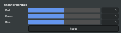
Channel Vibrance — additional per-channel offsets applied on top of Master Vibrance.
| Property | Description |
|---|---|
Red |
Extra vibrance for reds, on top of MasterVibrance. [min=-100, max=100, default=0]. 0 contributes no extra red vibrance. Use small positive values to make reds pop without boosting greens or blues. Negative values drain colour specifically from reds — handy for taming an over-warm scene. |
Green |
Extra vibrance for greens, on top of MasterVibrance. [min=-100, max=100, default=0]. 0 contributes no extra green vibrance. Positive values intensify foliage, grass and other greens without lifting other colours. Negative values mute greens — useful when background plants are pulling attention from the subject. |
Blue |
Extra vibrance for blues, on top of MasterVibrance. [min=-100, max=100, default=0]. 0 contributes no extra blue vibrance. Positive values bring out skies and water without boosting reds or greens. Negative values mute blues — useful for a warmer, sun-drenched look or to soften a strong sky. |
Reset |
Reset all settings to their defaults (Master, Red, Green and Blue vibrance all set to 0). |
Inherits from: AbstractOperator, AbstractAudioMetering.
See also: Vibrance in Script Engine Objects.
Related components
Composer's Color Correction family contains nine operators that work on the colour of the image. Each takes a different approach — picking the right combination is part of the grading workflow, and the operators are designed to be stacked. The other Color Correction operators are:
- Automatic Gain Control — measures average brightness in a sensor area and optionally nudges the picture back to a stored reference luminance. Good for stabilising drifting exposure on long-running feeds.
- Color Adjust — general-purpose colour correction with gain/gamma/lift, HSV adjustments, per-channel RGBA, and clipping in one operator. The fastest way to match cameras, tame highlights, or lift crushed blacks.
- Color Curves — master and per-channel (R/G/B/A) curve editor with an automatic grey-card camera-calibration workflow. The right choice when you need precise control over a specific tonal range.
- Color Shift — three-zone colour balance (shadows / midtones / highlights) along Cyan/Red, Magenta/Green, Yellow/Blue. Build cinematic teal-and-orange looks or fix mixed-lighting casts that hit shadows and highlights differently.
- Grading LUT — applies a pre-baked Hald CLUT image to drop a finished colour grade onto a feed in a single step. The fastest way to deploy a house style across many compositions.
- HSV Correct — per-hue curves for hue, saturation and luminance. Boost just the blues in a sky, lift skin tones without touching the background, desaturate one specific colour family.
- Hue Shift — selects a hue band by centre, tolerance and softness, then shifts its hue, saturation or luminance independently. The tool for recolouring a specific object without affecting the rest of the image.
- White Balance — corrects colour temperature (cool/warm) and tint (green/magenta) with presets for daylight, tungsten, fluorescent, and shade lighting.