
Hue Shift
Introduction
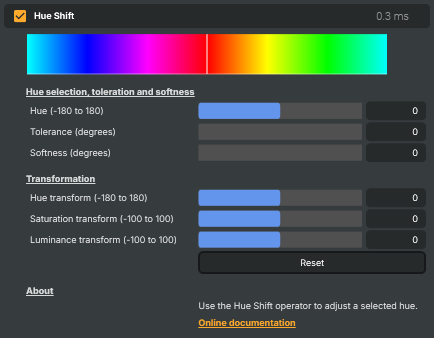
The Hue Shift operator lets you reach into the image, pick a single colour family — the reds, the greens, the cyans — and change only that colour, leaving the rest of the picture alone. Pick the colour to target, choose how wide a band around it to capture, and then dial in the transformation: rotate the selected hue to a different colour, push its saturation up or down, or change its brightness.
It's the operator to reach for whenever you want a colour-specific change rather than a global one. Recolour a red car to blue without painting the road blue too. Lift the greens in a sports pitch without making everyone's skin look ghoulish. Tame an oversaturated brand colour that's stealing focus from the talent. Pull a deliberate noisy colour band down a stop so it stops clipping. None of those tasks fit a global tool like Color Curves or Color Adjust well — they want a scalpel, and that's what Hue Shift is.
The two halves of the operator
Hue Shift is two steps. The top half selects which colours to affect; the bottom half transforms them. Both halves are independent — the same selection can be reused with very different transforms — and you tune them in that order.
Selecting the hue band
Three controls decide which colours are in scope:
- Hue (-180 to 180) — the centre of the band, in degrees around the colour wheel. The mapping is:
0≈ red,±60≈ yellow / magenta,±120≈ green / blue,±180≈ cyan. Pick the dominant colour of the object you want to target. - Tolerance (degrees) — the width of the fully-affected band around the centre hue.
0selects an extremely narrow slice (you'll usually want to widen it).20–40is a comfortable range for "select a colour family" work (the reds, the greens). Higher values pull in adjacent hues — useful when the target object has subtle colour variation across it (a not-quite-pure-red car, foliage with multiple shades of green). - Softness (degrees) — the fade-out width beyond the tolerance band.
0produces a hard edge: a pixel is either fully affected or not at all, which often shows as a visible colour boundary on objects whose hue varies across them (shaded skin, mixed-colour fabric, soft shadows). Larger softness values fade the effect smoothly into adjacent hues, hiding the boundary.
The combination acts like a trapezoidal selection on the colour wheel: a hard inner band of width Tolerance that's fully affected, plus a softer Softness-wide skirt on either side that fades the effect out to nothing.
Transforming the selection
Once a hue band is selected, three transformation sliders decide what happens to the colours inside it:
- Hue transform (-180 to 180) — rotates the selected hues around the colour wheel.
0leaves them alone;±60shifts to a neighbouring colour family (red → yellow, green → cyan);±180sends them to the complementary colour (red → cyan, green → magenta). The classic "change the colour of an object" control — centre on red, set hue transform to+120, and red things turn green. - Saturation transform (-100 to 100) — increases or decreases saturation only on the selected band.
0leaves saturation alone. Negative values drain colour from the target (set to-100to fully desaturate a chosen colour family). Positive values intensify it. - Luminance transform (-100 to 100) — brightens or darkens only the selected band.
0is neutral. Positive values lift the selected colour (e.g. brighten blue skies); negative values darken it (e.g. deepen blues for a moodier look).
The three transforms are applied at the same time, so you can rotate hue, knock saturation back, and darken brightness in one operator pass — useful when an object needs to land in a completely different colour mood.
How to set it up
The reliable workflow is:
- Spot the colour to target in the picture, and set Hue to roughly the centre of that colour family.
- Crank Saturation transform to -100 (fully desaturate) as a diagnostic — turns the selected hue grey while leaving everything else alone. This makes the selection visible.
- Widen Tolerance until the entire target object goes grey, but no further. Add Softness if the edges of the object still show colour bleed — that tells you the band is fading too sharply.
- Set Saturation transform back to 0, and now dial in whatever transformation you actually want — hue rotation, brightness change, or a saturation tweak in either direction.
Saturation set to -100 is the easiest way to see where Hue Shift is currently acting. Once the selection is right, return Saturation to 0 and apply the real transform.
Common use cases
- Recolouring objects — centre Hue on the object's colour, widen Tolerance to cover the whole object, then rotate Hue transform to send it to the new colour. The blue/red car classic.
- Boosting one colour family without affecting others — small positive Saturation transform plus a touch of Luminance transform on a chosen band makes that colour pop. Greens in a sports pitch, blues in a sky, reds in a uniform.
- Taming an oversaturated logo or brand colour — centre on the offending colour, widen Tolerance to cover its variations, drop Saturation transform by 20–30. Keeps the colour identifiable while reducing the visual yelling.
- Drawing the eye to a single colour — desaturate everything except one colour family. Two Hue Shift operators in series: the first desaturates everything (a very wide Tolerance, Saturation transform
-100), the second restores saturation on the target band only. - Pulling brightness out of a noisy colour — when a single colour is clipping or distracting, a small negative Luminance transform on its band reduces it without touching the rest of the image.
- Mood shifts on specific elements — darken skies (negative Luminance on the blue band), warm up shadows (a small positive Hue transform pushing blues toward purple), or cool down warm highlights — without affecting subjects whose colours fall outside the selection.
Hue Shift vs. HSV Correct
Hue Shift operates on one band at a time — centre, tolerance, softness, transforms. That's its strength: easy to set up for a single colour, easy to read what's going on. For complex jobs that need several simultaneous, independent adjustments — boost the blues, desaturate the greens, brighten the reds, all in one operator — reach for HSV Correct instead, which exposes a per-hue curve covering the entire colour wheel.
A rough rule: one colour → Hue Shift. Many colours in one pass → HSV Correct. Both are fine to stack if a job needs both.
Hue Shift - Settings
Hue selection, toleration and softness
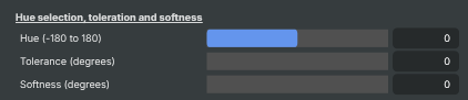
Hue selection, tolerance and softness — pick the band of colours that the operator will affect.
| Property | Description |
|---|---|
Hue (-180 to 180) |
Centre hue of the band to affect, in degrees around the colour wheel. [min=-180, max=180, default=0]. 0 ≈ red, ±60 ≈ yellow/magenta, ±120 ≈ green/blue, ±180 ≈ cyan. Pick the dominant colour of the object you want to target. Combine with HueTolerance and HueSoftness to control how wide a band gets affected. |
Tolerance (degrees) |
Width of the fully-affected band around the centre hue, in degrees. [min=0, max=100, default=0]. 0 affects an extremely narrow slice of colours. Larger values widen the band — try 20–40 for typical "select a colour family" work. Combined with HueSoftness to give a hard inner band plus a softer falloff. |
Softness (degrees) |
Falloff width outside the tolerance band, in degrees. [min=0, max=100, default=0]. 0 produces a hard edge — colours are either fully affected or not at all. Larger values fade the effect smoothly into adjacent hues, which avoids sharp colour boundaries on objects whose colour varies (e.g. shaded skin, mixed-colour fabric). |
Transformation
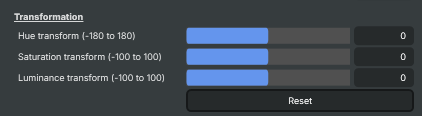
Transformation — what to do to colours that fall inside the selected hue band.
| Property | Description |
|---|---|
Hue transform (-180 to 180) |
How far to rotate the selected hues around the colour wheel, in degrees. [min=-180, max=180, default=0]. 0 leaves hues alone. ±60 shifts to a neighbouring colour family; ±180 sends them to the complementary colour. The classic "change the colour of an object" control — e.g. centre on red and set to +120 to turn red things green. |
Saturation transform (-100 to 100) |
Saturation change applied only to the selected hue band. [min=-100, max=100, default=0]. 0 leaves saturation untouched. -100 fully desaturates the selected colour family (useful for "isolate one colour, drain the rest" looks when combined with an inverted selection workflow). Positive values intensify just the targeted colour. |
Luminance transform (-100 to 100) |
Brightness change applied only to the selected hue band. [min=-100, max=100, default=0]. 0 leaves brightness untouched. Positive values lift the selected colour (e.g. brighten blue skies); negative values darken it (e.g. deepen blues for a moodier look). |
Reset |
Reset all settings to their defaults (Hue, Tolerance, Softness, all transforms set to 0). |
Inherits from: AbstractOperator, AbstractAudioMetering.
See also: Hue Shift in Script Engine Objects.
Related components
Composer's Color Correction family contains nine operators that work on the colour of the image. Each takes a different approach — picking the right combination is part of the grading workflow, and the operators are designed to be stacked. The other Color Correction operators are:
- Automatic Gain Control — measures average brightness in a sensor area and optionally nudges the picture back to a stored reference luminance. Good for stabilising drifting exposure on long-running feeds.
- Color Adjust — general-purpose colour correction with gain/gamma/lift, HSV adjustments, per-channel RGBA, and clipping in one operator. The fastest way to match cameras, tame highlights, or lift crushed blacks.
- Color Curves — master and per-channel (R/G/B/A) curve editor with an automatic grey-card camera-calibration workflow. The right choice when you need precise control over a specific tonal range.
- Color Shift — three-zone colour balance (shadows / midtones / highlights) along Cyan/Red, Magenta/Green, Yellow/Blue. Build cinematic teal-and-orange looks or fix mixed-lighting casts that hit shadows and highlights differently.
- Grading LUT — applies a pre-baked Hald CLUT image to drop a finished colour grade onto a feed in a single step. The fastest way to deploy a house style across many compositions.
- HSV Correct — per-hue curves for hue, saturation and luminance. Boost just the blues in a sky, lift skin tones without touching the background, desaturate one specific colour family.
- Vibrance — boosts the colourfulness of muted tones while protecting already-saturated colours and skin tones. Make landscapes pop without making faces look orange.
- White Balance — corrects colour temperature (cool/warm) and tint (green/magenta) with presets for daylight, tungsten, fluorescent, and shade lighting.