

Interactive Button
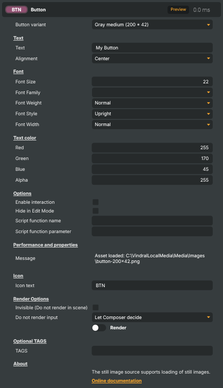
Adds a clickable button as a video layer in a scene. The button shows a chosen background graphic (one of four built-in size variants) with custom text on top, and — when Composer is running in Interactive Mode — fires a Script Engine function each time the operator clicks it. Useful for building simple operator panels, on-screen control surfaces, or quick triggers for scripted actions.
Interactive Button - Settings

| Property | Description |
|---|---|
Button variant |
Pre-built button graphic to use. [default=Size200By42]. Picks one of four built-in button background images, each at a fixed size: Size100By22 (100×22), Size200By22 (200×22), Size126By42 (126×42), or Size200By42 (200×42). Switching variant also resets the font size to a value that suits the chosen button graphic. |
Text
Text — the button's label and how it's positioned.

| Property | Description |
|---|---|
Text |
The text shown on the button. [default="My Button"]. Set from a script to change the label at runtime — for example, switching between "Start" and "Stop" depending on the state of another component. |
Alignment |
Horizontal alignment of the text within the button. [default=Center]. Left, Center, or Right. |
Font
Font — typeface and how the letters are drawn.
| Property | Description |
|---|---|
Font Size |
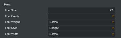
Size of the text in pixels. [min=6, max=256, default=22]. Reset automatically when ButtonVariant is changed, so that the text suits the new button background. Override afterwards if you want a different size. |
Font Family |
Which font to use for the button text. Picks the typeface from the fonts installed on the system. When sharing a project, make sure the chosen font is also available on the destination machine. |
Font Weight |
How thick the strokes of the letters are. [default=Normal]. Ranges from Thin and Light through Normal and Medium up to Bold, ExtraBold, and Black. Only takes effect when the chosen font ships with the requested weight — otherwise the closest available weight is used. |
Font Style |
Whether the text is upright or italic. [default=Upright]. Upright is regular, non-slanted text. Italic slants the letters in the font's designed italic style. Oblique is a synthetic slant the renderer applies when the font has no dedicated italic. |
Font Width |
How wide or narrow the letters are drawn. [default=Normal]. Ranges from UltraCondensed and Condensed through Normal to Expanded and UltraExpanded. Only takes effect when the chosen font ships with the requested width — otherwise the closest available width is used. |
Text color
Text color — colour of the button's label text.
| Property | Description |
|---|---|
Red |
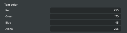
Text color red. [min=0, max=255, default=255]. |
Green |
Text color green. [min=0, max=255, default=170]. |
Blue |
Text color blue. [min=0, max=255, default=45]. |
Alpha |
Text alpha. [min=0, max=255, default=255]. |
Options
Options — interaction and click-handler settings.
| Property | Description |
|---|---|
Enable interaction |
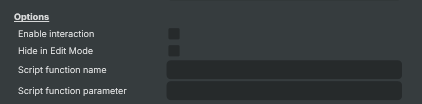
Whether the button responds to clicks. [default=false]. When true, and Composer is running in Interactive Mode, clicking the button fires the Script Engine function named in OnClickFunction. Disable for a non-clickable graphic, or to temporarily lock the button. |
Hide in Edit Mode |
Whether the button is hidden while the project is being edited. [default=false]. When true, the button only appears when the project is running, so it doesn't clutter the editor view. When false, the button is visible in both edit and run modes. |
Script function name |
Name of the Script Engine function to call when the button is clicked. Only used when IsInteractive is true. Set this to the exact name of a function defined in your Script Engine project. Leave blank to skip the callback. |
Script function parameter |
Optional value passed to the click-handler function as an argument. Only used when IsInteractive is true and OnClickFunction is set. Useful for reusing the same handler across several buttons and telling them apart by parameter. |
Performance and properties
Performance and properties — runtime status from the input.

| Property | Description |
|---|---|
Message |
Most recent status, info, or error message from the input (read-only). |
Inherits from: AbstractInput, AbstractAudioProcessing, AbstractAudioMetering.
See also: Interactive Button in Script Engine Objects.
Shared input properties
Every input — regardless of source type — exposes the following property groups. They are surfaced in the property panel only when Show advanced options is enabled on the input.
Icon
Icon text— short text shown on the input's icon in the Inputs list. Useful as a quick visual label (channel number, mic name, camera position) to tell otherwise-similar inputs apart at a glance. Empty by default; has no effect on rendering or routing.
Audio mixer
Hide in audio mixer— when on, hides the input from the audio mixer view without disabling its audio. Useful for de-cluttering the mixer while keeping the audio routed (e.g. fixed background music, ambient beds, pre-aligned playout). [default=false]
Render Options
Invisible (Do not render in scene)— when on, the input is skipped during rendering and produces no picture on any layer or scene. Audio routing is unaffected. Toggle from a script for cued-in / cued-out behaviour during a show. [default=false]Do not render input— disables the input's internal render entirely (no decode or capture work is done). Stronger than Invisible: that one renders but doesn't display; this one stops the input from doing any work at all. Useful for reducing CPU / network load on heavy sources (e.g. high-bitrate RTMP / SRT streams, large media files) when the input is temporarily not needed. Audio meters are cleared while disabled. [default=false]Do not render inputcontroller — chooses what drives the Do not render input flag.Let Composer decide(the default) hands control to the project-level Render Tuning optimiser, which automatically pauses inputs that aren't used by any active scene.Manual Configurationignores Render Tuning and lets the Do not render input toggle control the flag directly — use this to keep a network source warm even when it's currently off-air, or to take a heavy input down by hand regardless of scene activity. [default=Let Composer decide]
Optional TAGS
TAGS— one or more free-form tag words used to classify this input (typically space- or comma-separated). Picked up by Composer's Smart Search to filter or find inputs by category — e.g.camera,music,interview,sponsor. Has no effect on rendering.